Hide / Seek
THE BUTTON HOLE AND NOT THE BUTTON
A Conversation with Calla Thompson and Jaimes Mayhew at the exhibition Hide and Seek: Difference and Desire in American Portraiture at the National Portrait Gallery in Washington D.C.
When I went first went to see the Hide / Seek exhibition in December of 2010 I did so with a sense of urgency and anger in response to the censoring of the David Wojnarowicz video Fire in my Belly. It is completely indefensible that the National Portrait Gallery folded so quickly when a Roman Catholic (!) bishop and a handful of rightwing politicians objected to a video they had not even seen, never mind took the time to experience and think about. Wojnarowicz was a passionate human being whose work was, even in its outrage, concerned with life, sacrifice, the dispossessed, the sacred and the profane, in other words, all the themes and obsessions a visionary artist / secular saint should fervently embrace. In spite of the Wojnarowicz fiasco, there was much in the exhibition that was provocative, subversive, revelatory, and beautiful.
Along with churches, libraries, and galleries, I have always thought of museums as public spaces for private contemplation. I love the atmosphere of engaged silence that can permeate the rooms of a museum. One can be prodded and solicited at each turn as images reveal themselves sometimes by pronouncement, sometimes quietly, almost furtively. In the case of Hide / Seek, I felt my imagination sparking up with questions and memories about sexuality, gender and desire. I thought it would be good to return with friends who might also react animatedly to this show. Calla Thompson and I are colleagues in the Visual Arts Department at the University of Maryland, Baltimore County. Originally from Toronto, Thompson’s work in digital imagery and installations has been exhibited at numerous galleries and institutions here and abroad, including the Painted Bride in Philadelphia and the Everson Museum of Art. Jaimes Mayhew is a self-described artist/educator/organizer. He completed in MFA in the Imaging and Digital Arts Program at UMBC in 2010. He has participated in a number of influential artist collaboratives including the Institute of Infinitely Small Things and Services United.
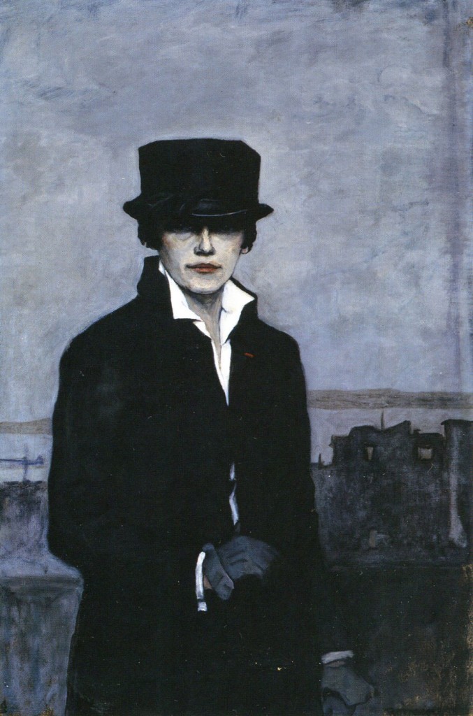
On the morning of February 12, 2011, after acquiring our caffeinated beverages from Common Grounds in Baltimore we hopped into the rented Dodge Ram and headed south to D.C. The conversation in the car revolved around the politics of gender, sexual orientation, coming out stories, transgender healthcare, and spousal rights for gay couples. Outside the National Portrait Gallery was parked a substantial metal container turned office which was screening the offending Wojnarowicz video and offered a wall length timeline of censored art in history. Inside the museum, after hurriedly passing through the halls of presidential portraits and a photography exhibition on the Civil Rights Movement, we approached a self-portrait by Romaine Brooks.
CT – I am surprised by how blue it is. I knew it was this darker palette but could never see the subtle transition between areas of color, or detail in the shadows, in reproductions.
MAD – I know it seems so graphically black and white in reproduction.
CT – Because there is this wider palette when you see this Brooks in person its not quite as severe as it seems in reproduction – I was always drawn to that severity and here it feels somewhat softer – you can more easily see the aging in her face. And there is something that might be labeled effeminate about the curved gesture of her hand which is opposite of the severity of the dark coat against the white shirt and dark hat against the pale face.
MAD – It’s less rhetorical in person – its more sensuous.
JM – It’s a bit dandyish – It’s really sexy.
CT – Right and I never felt that from the reproduction.
MAD – That little slash of red there on the lapel – its just enough right?
CT – And the fact that the red slash is at the buttonhole and not the button – it’s a metaphor for a bleeding vagina or a wound – it’s a small dash of blood over the heart.
MAD – And there is a bit of a come on there in the way she appears to be opening her coat ever so slightly.
CT – This echoes the slash.
M – So when we were driving down here this morning and you guys were talking I was thinking about being in my 20s and how important androgyny was to us. How it was a kind of goal or an ideal.
CT – For our generation I think it was, that place right in-between – to be both male and female, to possess that mystery and that promise.
MAD – This painting reminds me of the August Sander portrait of the woman wearing a white shirt and pants, hair slicked back, cigarette between her teeth. I think everyone I knew back in the 80s had a postcard of that image pinned up somewhere in their house.
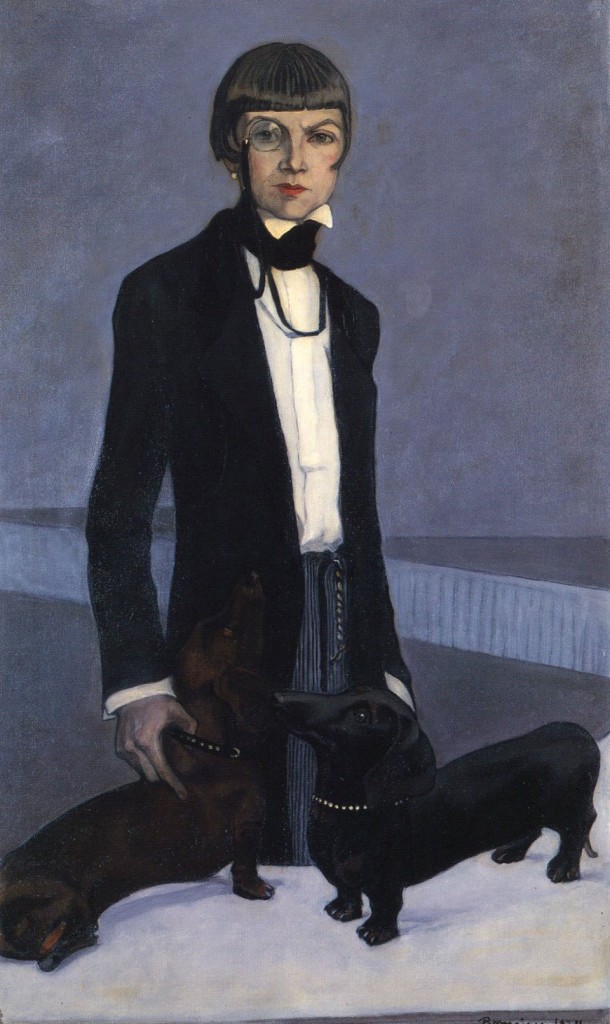
We turn our attention to the second Romaine Brooks painting titled Una, Lady Troubridge (1924)
CT – There was the fashion of the time of wearing men’s clothes – especially jackets and shirts with pants or skirt.
JM – In the 1920s.
CT – Yes – This painting is more humorous than Brooks’ self-portrait, especially with those two wiener dogs elevated and appearing at Lady Troubridge’s crotch level – I mean it’s very funny. Dogs as phallus. One wasn’t enough, so there is a double phallus. It is twice as masculine. Very funny. I need to get a monocle and an ascot.
JM – You could do a series of photographs imitating these paintings – then you would have to have an ascot – you could justify it as research.
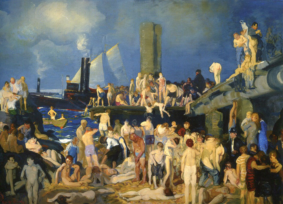
We pause in front of River Front No. 1 (1915) by George Bellows
CT – The docks have been used for the same purpose for generations.
JM – Well now the docks have been revamped as fancy parks – it’s not this sort of public space anymore.
MAD – You mean they have been kind of neutralized – you’ve done some work on that right?
JM – Yea I did a project a few years ago about these piers. The piers were a kind of gay sex haven – a hangout for young people. They were fenced off in the 1990s and then they built these parks that kind of look like a golf course, or at least very suburban and clean. But since the piers have been transformed into public parks, there are also curfews there. And these particular piers are still a safe place for LGBT kids to go especially if the neighborhoods they come from aren’t safe. But there is a lot of conflict between the mostly white upper class people that live in the West Village and the kids that go to the pier to hang out, which has created some turmoil for a lot of LGBT people in New York City.
MAD – In this painting there is a confusion of indistinct bodies especially in the center where it becomes this amorphous writhing mass and as your eyes move toward the periphery you see individual relationships like these two down in the shadows of the left hand corner – the way that they stare at each other and the frontal nudity and his relaxed posture is so sexually frank.
CT – And its interesting that the only two female figures are huddled together fully clothed.
JM – With a kid.
MAD – The women seem to be protecting the idea of the family, they are huddled and seemingly appalled or repulsed by what is going on.
CT – They are so close to each other and touching.
MAD – But not in the sense of a celebration or freedom of sensuality but are holding each other for protection. And this figure who is a stand in for the painter – he is also fully clothed and of a different class.
JM – It’s interesting to look at this painting and think about what the docks became and what they meant for gay people in later generations.
CT – I think Pre – AIDS – it was a place for anonymous sex for gay men.
JM – And some women too, I did a bunch of interviews for that project with people who used to hang out there and was surprised to learn that there were women too – mostly because you don’t read about that as much. The piers were dark and dilapidated – you would have to memorize your way around so you wouldn’t fall through holes in the floor. It was about feeling more than seeing.
Crescendos of Gospel music surge from the Civil Rights exhibition The Struggle for Justice in the adjacent galleries.
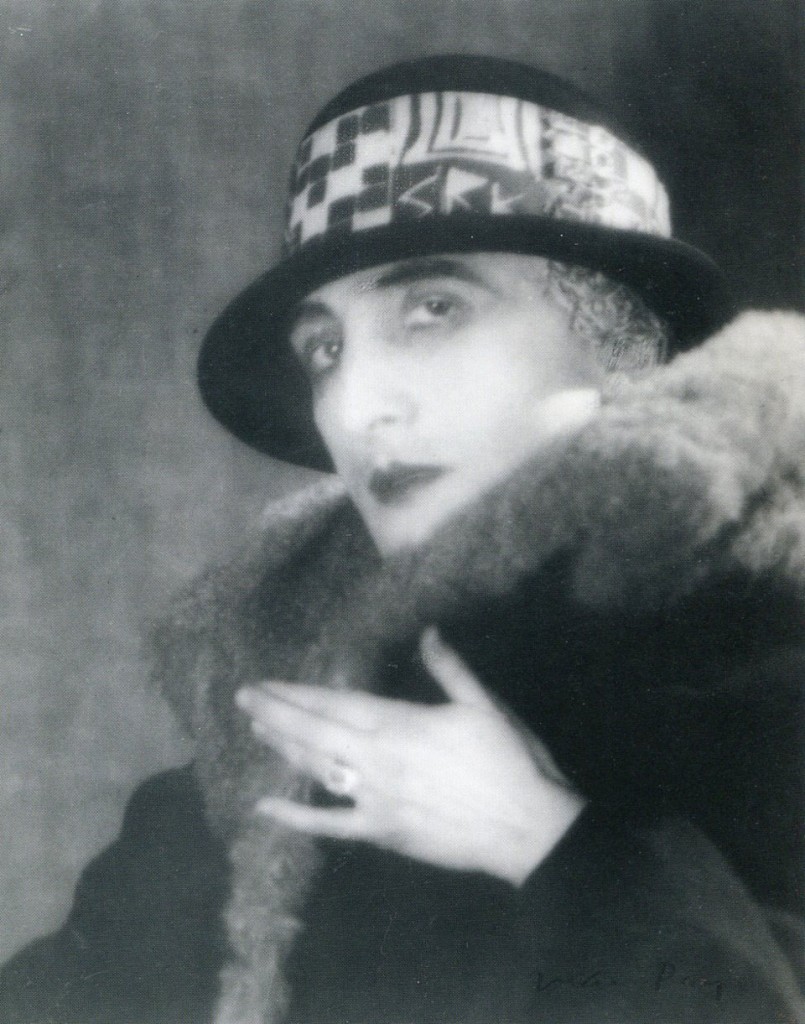
CT – This portrait of Marcel Duchamp is interesting.
MAD – Who made it? Oh it’s by Florine Stettheimer – there’s a great, primitive yet almost lurid painting of hers at the BMA (Baltimore Museum of Art), of the British photographer Baron de Mayer.
CT – What is interesting about this painting is that its just the head, the head disembodied – it reads as all gender as well as the complete absence of gender. I love the radiating lines that emanate from the head.
The three of us stand there silently for the longest time looking at Duchamp’s portrait
MAD – There’s androgyny which can be sexy and appealing in many directions and then there’s asexuality or a kind of desexualized quality – which makes me think that I never found Duchamp particularly sexy. I guess I never really thought about Duchamp’s’ body. Is Duchamp sexy?
JM – I think so.
CT – The Rose Selavy self-portrait (which is adjacent to the Stettheimer) is the only piece in which Duchamp declares his body as female, or enacting the female, at least from what I know of his work. The Stettheimer is an odd painting because it pictures him as somewhere between life and death. I think that has to do with the disembodied nature of it but also because of the pallor of the skin…
JM – And all of the lines radiating out.
CT – Right and the aura that surrounds him. Was it painted when he was alive?
MAD – Yes.
CT – Because it feels drained in a sense.
JM – That’s the thing that’s really confusing about it, because it’s the eyes that really throw me off, because the image could represent a point of orgasm but the eyes are kind of droopy, dead or checked out. The Rose Selavy portrait reminds me of our discussion of gender, in this case assigned gender versus some other gender that you assign yourself onto your own body. It makes sense that he would have a body, display his body in this image, because Duchamp was all about reassigning objects within different contexts. But what I find sexy about it is that under all that transformation he is leaving his eyebrows really thick and bushy.
MAD – And look how tiny and delicate those hands are.
JM – They are elegant.
CT – And the gesture of the hand is so odd.
MAD – It looks like a gang sign.
CT – Or a reverse Trekkie.
JM – Isn’t that the wedding finger he has a ring on?
MAD – One could crop that part of the image and use that hand to make art – its kind of extraordinary. There are art careers made from less.
CT – I’ve seen this image a million times in reproduction and never thought about the hand.
JM – It gestures toward the body, not away.
MAD – So what was the deal with Duchamp was he straight / gay / married / kids?
CT – Want me to Google that right now? When I was in my early 20s (in the 1980s) I was obsessed with making long typed lists of everyone who I heard was gay – all these popes, everyone. Then I would lose the list and have to start over and recreate it.
MAD – There must have been some pleasure there, making the lists.
CT – Well it was a re-affirmation – I’m gay, they’re gay.
JM – I am really excited about your graphic novel idea
CT – Me too, its autobiographical – the story of growing up and coming out in Toronto in the 1970s.
We turn around to the opposite wall behind us.
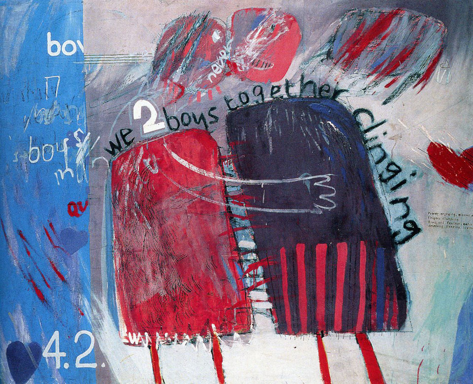
MAD – This early painting by David Hockney was a revelation to me. ‘We two boys together clinging’ I never saw it before – not sure how I missed it.
CT – I think I may have seen it once or twice in reproduction in the 1980s.
MAD – Painted in 1961, when he was 23 or 24, still living in England. The wall text says that homosexuality was not decriminalized in England until 1967. Almost lets me forgive him for all that insipid work that he made in California. The fragmented words are from the Walt Whitman poem of the same name. I love this lyric scribbled on the right side “power enjoying—elbows stretching—fingers clutching, Arm’d and fearless—eating, drinking, sleeping, loving” Its so great!
JM – Its really sweet but also like a manifesto.
CT – Especially for the time – looks like all the boys he knew had a lot of back hair. Or maybe its just fringe.
MAD – Or a hair shirt – But I love the declarative nature of this painting, the passion, the urgency, the fervor and sweetness of it. Look at the lips blurring together, I mean he has painted hearts all over it. Did you ever think a heart shape could be a kind of manifesto?
CT – On the left side two red letters start to maybe spell out ‘queer’ but its cut off. I don’t thinks that’s a word that was used as often in 1961, at least not in an affirmative way. I wonder if that’s what he is alluding to.
MAD – its kind of inescapable.
JM – Well what is this whole left section about since its separate from the embrace, it has letters, hearts, and numbers. There are a lot of numbers actually all over the painting.
A woman joins our discussion suggesting that the numbers might refer to the criminal code.
CT – It was probably paint by number originally. We need Hockney here. Just have a phone next to the painting – direct line to Hockney.
JM – I think we should just do a Calla podcast where you could answer all the questions, true or not.
CT – Its funny that there is any controversy around this show, so far I find most of the imagery has a strong use of metaphor but very tame.
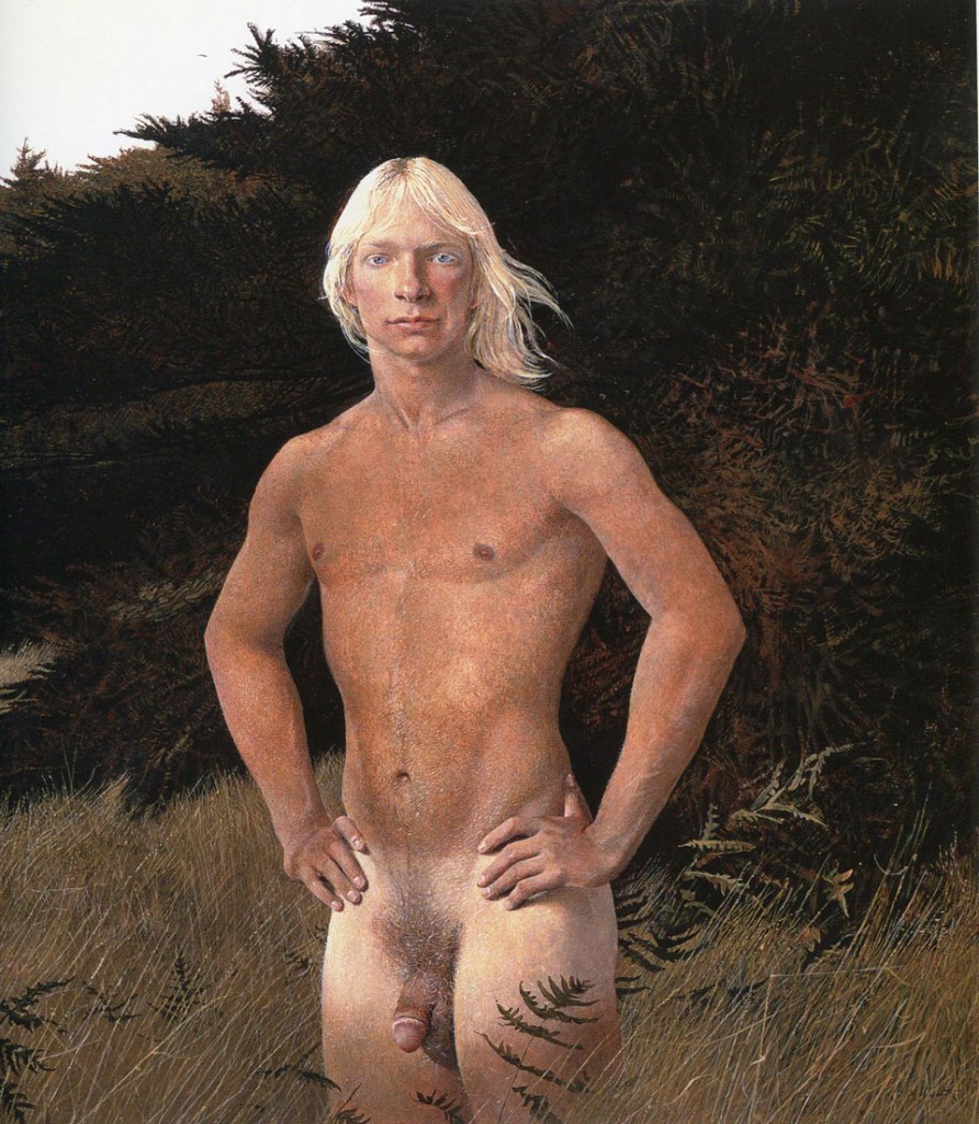
MAD – How about this Andrew Wyeth painting.
JM – Its frightening.
CT – He looks like some bad 70s…………….
A cell phone rings loudly with repeating chords of Beethoven’s 5th Symphony – a nearby woman shuffles in her bag and answers loudly, ‘Hello, I’m at the gay art show!”
CT – Really? Can you say hi for me?
MAD – I think of Collier Shorr’s work when I see this.
CT – Even though the figure is completely nude in this painting it reminds me of Schorr’s images of soldiers in uniform. The blond Aryan warrior.
JM – The stance and the setting too.
MAD – His body does not seem sexual or sensual – it’s more like a suit of armor, impenetrable. Well maybe that’s me, maybe I don’t like hard young bodies, well, no that can’t be it. Maybe it’s the landscape I don’t like.
CT – Considering all the warm tones of the painting – the skin, the grass, the hair – there is iciness to the painting.
MAD – Its that typical New England Yankee detachment from pleasure.
CT – Despite the supposed warmth of the painting you wouldn’t want to fuck with this guy.
MAD – You mean fuck in terms of sex or not wanting to mess with the guy.
JM and CT – (in unison)Don’t mess with!
MAD – This painting is from 1979 – reminds me of the earlier 70s when I was a teenager – my friends and I, sort of late-hippie kids, were often running around the woods semi-clothed. We were wild in a kind of tempered way – But it never felt sexual, nudity was not a big thing for us.
CT – Because everyone was still coming down form the free love 1960s there was a lot less shame around the body. I think now, particularly in the United States, there is much more shame about the body. I can see people being uncomfortable or flipping out about this image but in the 70s it was kind of conventional.
MAD – Yea, it would it would be on the cover of an Eagles album, you know, (singing) “taking a stroll on the grounds of the Hotel California.”
JM – Well I think this painting is about being ‘natural’ – its not sensual at all. It’s like “I was walking through the forest with my paints and I ran into this guy and I asked him to pose”. It is sensual in the sense that the artist spent a lot of time observing this body. It changes the gaze a lot that this is a painting and not a photograph.
MAD – The pose also suggests a satyr or centaur.
JM – He is like a centaur.
CT – Its interesting too that there is so much more attention to detail in the body and genital area than the face and eyes – the top of his face is a little soft focused.
MAD – Andrew knew what was important.
MAD – A really odd juxtaposition of Lukas Samaras and Cathy Opie.
CT – Its quite weird how they have hung them. I like they way the Cathy Opie images loom over us but the pairing with the Lukas Samaras is strange.
MAD – When you first saw these Opie pictures were they significant to either of you?
CT – I am most interested in the third portrait, Jake, where there is more ambiguity around the gender of the figure. The others seem too….
JM – Theatrical.
CT – Yes theatrical, whereas the third image feels more honest in a way – the lighting is more diffuse and the chin is up and has more attitude. It’s less of a mask.
JM – In that image gender is embodied in a very different way than the others, which feel very draggy. Jake can really wear that moustache and make it believable.
CT – But overall I don’t like them very much – they feel like images of clowns or something.
JM – I think of drag kings when I see these images – these are about performing gender.
MAD – I have to say that I am not a big fan of Opie’s work in general but if representations matter and these pictures are twenty years old now. Do you think they were important back then in terms of putting images in public that challenged conventional portraiture and gender binaries?
JT – They matter like Judith Butler matters – these pictures could be used to explain Butler’s ideas about gender being a performance. I think that when these pictures were made in the early 90s, there was less language or vocabulary to talk about sex, gender, drag, transgender, etc. That Jake image is kind of like what you were describing Calla about your lived experience of being harassed on the street. Jake’s attitude seems more honest, more embodied. This is what Jake looks like walking down the street, whereas the other portraits, I’m not so sure.
MAD – Its so disturbing and nonsensical that they hung this Lukas Samaras grid just below – I mean, I never got this guy, he’s been around forever and yes they are playful but they just seem pointless and adolescent.
JM – They should have hung Duchamp’s Rose Selavy there instead.
MAD – You’re right, and Duchamp only needed one image to make his point.
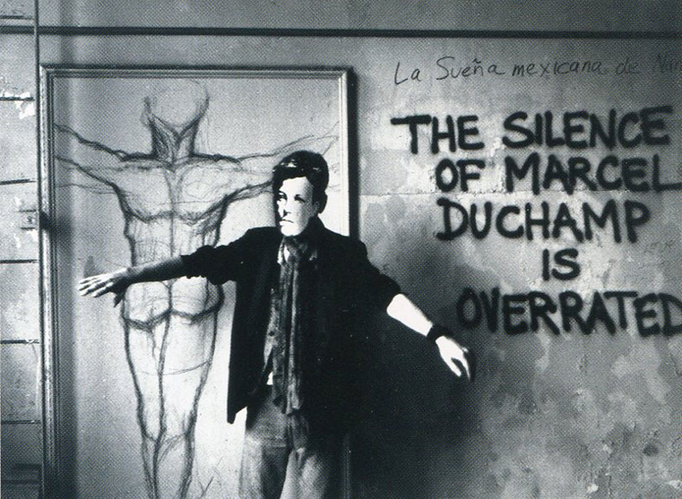
Now we stand in front of David Wojnarowicz’s photographic series Arthur Rimbaud in New York
MAD – Rimbaud – the libertine poet, romantic hero to Wojnarowicz, Patti Smith, Bob Dylan, Ginsberg….
CT – Its interesting the places he is photographing himself, the subway, under a bridge, at the piers, all these cruising places in which to picture himself as romantic renegade. I love how raw the images are – like the subway picture, clearly not enough light, it’s a little out of focus, but who cares? It’s more important to make the image you need to make. Do you know who he worked with to make these?
MAD – No, it’s a good question, but his partner and mentor was Peter Hujar and he was an extraordinary photographer, his images are knockout beautiful, formal and exquisitely rendered, not rough and visceral like these. I love the directness of Wojnarowicz’s approach to whatever he was doing. Whether it was writing, painting, photography, performance, or even the film that was censored from this show, there was always accessibility. He wanted his work to be a readable as graffiti.
JM – I wonder if that has a lot to do with his being self –taught?
MAD – I think so, I have always thought of Wojnarowicz as a folk artist – not in the sense that he was naïve in any way, obviously he was quite sophisticated politically, but just that he did not let his lack of virtuosity hold him back. He was not in dialog with the history of the medium, he didn’t seem to care about some theoretical abstraction, he wanted to communicate directly and urgently.
CT – I love his death portrait. The fact that his face is out of focus, vulnerable and collapsed and his head just floats in black space and the fist is the same size of his head – it feels very much like a ‘fuck you’. I think it was taken a very short time before he passed away.
JM – The skull staff is the only thing holding the foreground.
CT – Right, the photograph is like a sky with two moons.
MAD – I was an undergraduate studying photography when Mapplethorpe was really coming into his own. And although we liked him, especially his portraits of Patti Smith, I think we misunderstood him. We wanted so shake up photography with radical formal gestures and we thought Mapplethorpe was really conservative. We missed the radicality of extending notions of classical beauty to the margins, to the various underworlds he participated in.
CT – What do you think of Felix Gonzalez Torres?
JM – I love him, he is my hero.
CT – It’s just so moving, and I’m not moved by art very often.
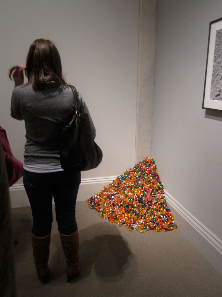
JM – There’s a great essay that Sal Randolph wrote that begins by stating that she keeps a piece of candy from an installation of this work on her desk, that always strikes me as so beautiful. I am going to do the same thing. I love the gesture of giving something away that also produces a level of anxiety because people are not sure they are really supposed to take it. While we were talking about the Mapplethorpe portrait I was watching people freaking out a little bit trying to decide to take a piece of candy or not. But if you do reach down and grab a piece you become part of the work and you are rewarded with this sweet candy that has been hand-wrapped in colorful cellophane. It’s so simple.
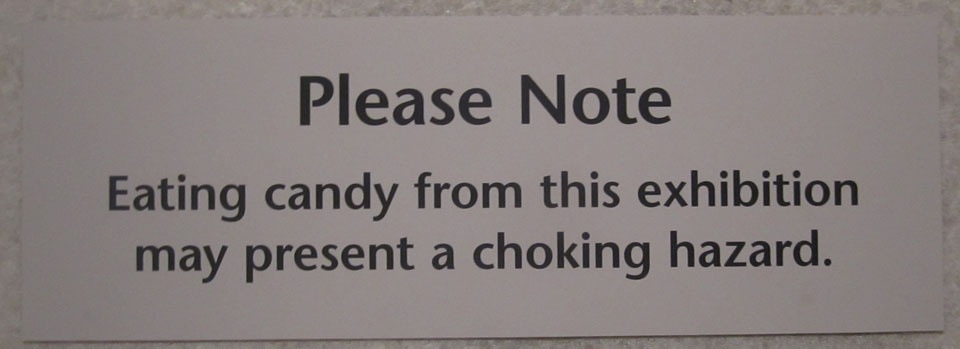
CT – I wonder if the wall text suggests taking a piece?
MAD – This is the most important text right here. LAUGHTER
MAD – The thing about Gonzalez Torres was that he was this important transitional figure between the overwrought and overstated esthetic of the 1980s, and I include myself in that, to a more subtle and economical sensibility, the restraint in his work was stunning.
JM – He is a master of simple poetic statements that expand outward. I first saw his work when I was nineteen at PS1, those stacks of posters with abstractions like a close-up of the sky or the sea, which are already these immense fluid things. I freaked out because I had never seen anything like it – it was exactly what I wanted to see in a museum. But to be dispersing thousands of these abstract things from the museum or gallery as gifts is also this abstract and immense thing to do. There are thousands of people with the same image of the sky or sea – distributed through Felix’s generosity.
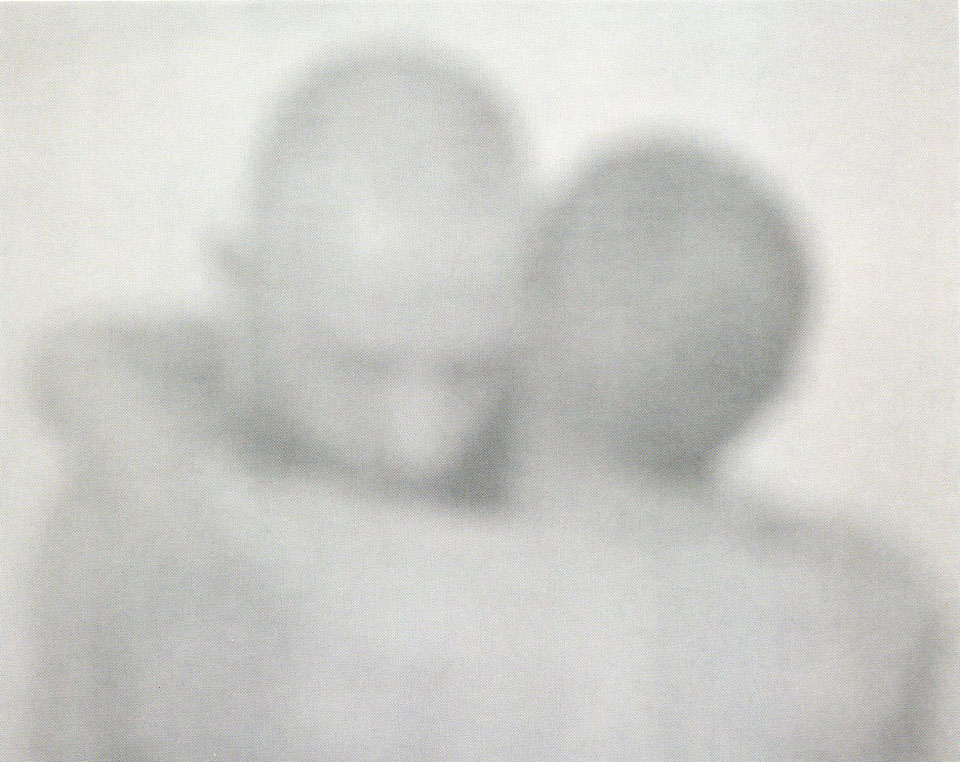
MAD – Lets look at this Bill Jacobson image – I was thinking that if the Hockney painting evokes the hungry yet playful embrace of youth, this photograph is the other side of that especially in terms of AIDS, – there is a mournful desperation here.
CT – There is clarity in that the figures are older – the baldness also suggests age or illness.
JM – Its also titled ‘Interim Couple’. It makes sense that it would suggest AIDS because it feels really ghostly and you aren’t sure where the edges of the figures are, where they are or if its even real, it could almost be a watercolor. It’s just filled with ambiguity.
CT – Even though it says ‘Interim Couple’ it doesn’t feel like an embrace hello or goodbye it feels like a forever embrace. It feels like they are locked in that position, the bodies are so melded together that they will never move apart, as if they were one body in a sense.
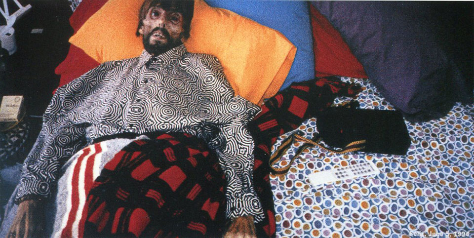
CT – There’s General Idea
MAD – God, its so hard to look at that
CT – I think that initially this piece is utterly horrifying but knowing their work and their sensibility there is some macabre humor here as well. It is an extension of their work and life together, I mean they really blurred the line between their lives and their art and always did so with humor. They were dealing with AIDS in their lives and in their work very early on. At the point when this picture was taken of Felix by AA Bronson, Jorge Zontal had already died.
MAD – Still hard for me to see the humor.
CT – Well look, its not just any bed – there is all this color – the absurdity of those pajamas or shirt. There is something about the way he stares out – he’s dead at this point but his was so dehydrated he could not even close his eyes in death.
MAD – It had to have been deliberate that the curators hid this monstrously large image behind this wall because it would dominate the room, if not the entire show. I think they had to screen it because of its intensity.
CT – Its not just the intensity of his death, it’s the scale, the brightness, the pixilation and I love that he has his Marlboro cigarettes next to him. I mean that’s funny right? When you think about the image of the Marlboro man.
MAD – What do you think Jaimes?
JM – I have not seen it before and it is pretty horrifying to look at but I can’t stop looking at it.
MAD – The image has become iconic – in gay history, AIDS history – it’s like the dead Christ.
CT – I don’t know this for sure, but I would guess that Felix was in on it. I’m sure there was an agreement that this image would be made once he passed away. It’s a very different image than the post mortem image Annie Leibowitz made of Susan Sontag.
MAD – Many people were upset by that image, that somehow it as inappropriate. I don’t remember this image of the dead Felix causing the same uproar. I wonder it is because, as you suggest, this is a kind of performance, Felix’s final performance.
CT – The members of General Idea were out as gay men from the start, and the relationship between Leibowitz and Sontag was more furtive and private, so the image Leibovitz made of Sontag was less expected.
JM – It may also be just a lack of concern for a gay man who had died of AIDS versus someone who was a lesbian but was Susan Sontag, a more revered public figure. Also there is nothing precious about this image, things are tossed around his body, the framing is odd, it is grainy, it feels almost spontaneous yet is at this monolithic scale.
MAD – Can you say, “This picture is so hot” again? The recorder was off.
JM – This picture is so hot! LAUGHTER
MAD – Its such a direct photograph yet still mysterious.
JM – Mysterious?
MAD – Well, I guess in the sense that all people are mysterious on some level when you try to read beyond the surface. And that is all photography has to go on – surfaces. She, I guess it’s a she, has such a rhetorical presence with that hat and the tattooing, and rhetoric generally serves positioning vis a vis other positions – but in sense she is announcing ambiguity not certainty. Also sexiness is mysterious, sexy people are kind of enigmatic.
CT – The shirt is important – it both reads masculine and hides to some extent, her breasts.
JM – The name Macauley as a chosen name – which I am assuming it is a chosen name – is great. Many people who are assigned female at birth who are either more butch or are trans-masculine often wind up looking like very young men. It reminds me of Macauley Culkin.
CT – I like that there is nowhere to go in the photo – no horizon, no escape, Macauley is right up against the wall, not going anywhere.
